The more time I spent on automated testing, the more I felt the need for a results formatter that would streamline the process of prioritizing and fixing failing tests. I was on the look out for a formatter that would organize and present test results in a way that could both recognize patterns and make it more efficient to find the true source of a failing test.
The problem I kept running into is that all of the formatters I found treated every test failure as an isolated issue. However, in practice, I often found that a multiple failures could often be traced back to a single change in an unrelated area of the code. I’d end up scrolling through test failures trying to identify a pattern.
It was always tedious, and it was often difficult to identify related failures. That was definitely going to be a job for a computer. So I started tinkering with formatters to see if they could proactively group similar results/failures and do a better job of recognizing nuance in test failures.
After some experimentation, I created a custom reporter for Minitest to try and proactively identify the underlying source of a problem by inspecting and classifying each failure and customizing the information displayed based on the context and type of failure. It also presents a heat map summary to help more quickly identify individual areas that are likely to be causing the other errors.
Nuance in Test Results
The first detail that makes Minitest Heat a little different revolves around recognizing nuance. Instead of Pass/Fail/Exception, it goes into a little more detail. When a test passes, it also considers whether that test was fast, slow, or “painfully slow’. In the case of an exception, it considers whether the exception arose directly from the code in the test or from the code being tested.
For example, if an exception is triggered from the source code, then that’s a special failure case worth investigating as a failure. If, however, an exception arises from the test code, that’s not necessarily a failure of the source code. It’s simply a "broken” test rather than a pure failure. It also supports the ability to set thresholds for slow and “painfully slow” tests so that even a passing test can be flagged for attention if it’s dragging down the test suite.
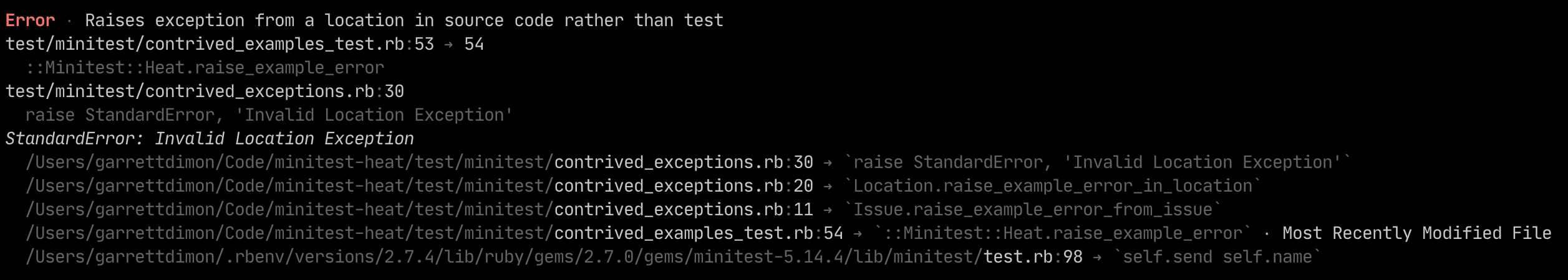
With exceptions raised from the source code, they’re flagged as an ‘Error’ (mainly because it’s shorter than ‘Exception’) with a slightly more bold red. It shows the related details about the test that prompted the exception and the source of the exception with a consolidated stack trace.
↩︎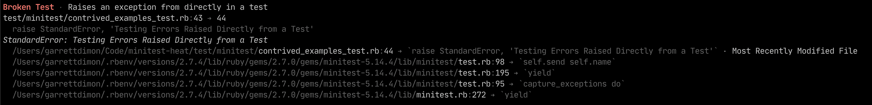
When an exception is raised directly from test code, it’s labeled as a ‘Broken Test’ to make it clear that the test is the problem. While source code exceptions can stem from details in the test, it’s nice to short-circuit the investigation process by knowing the exception came directly out of the test code.
↩︎With these insights, test results have additional context that can help you prioritize how you approach fixing failed tests.
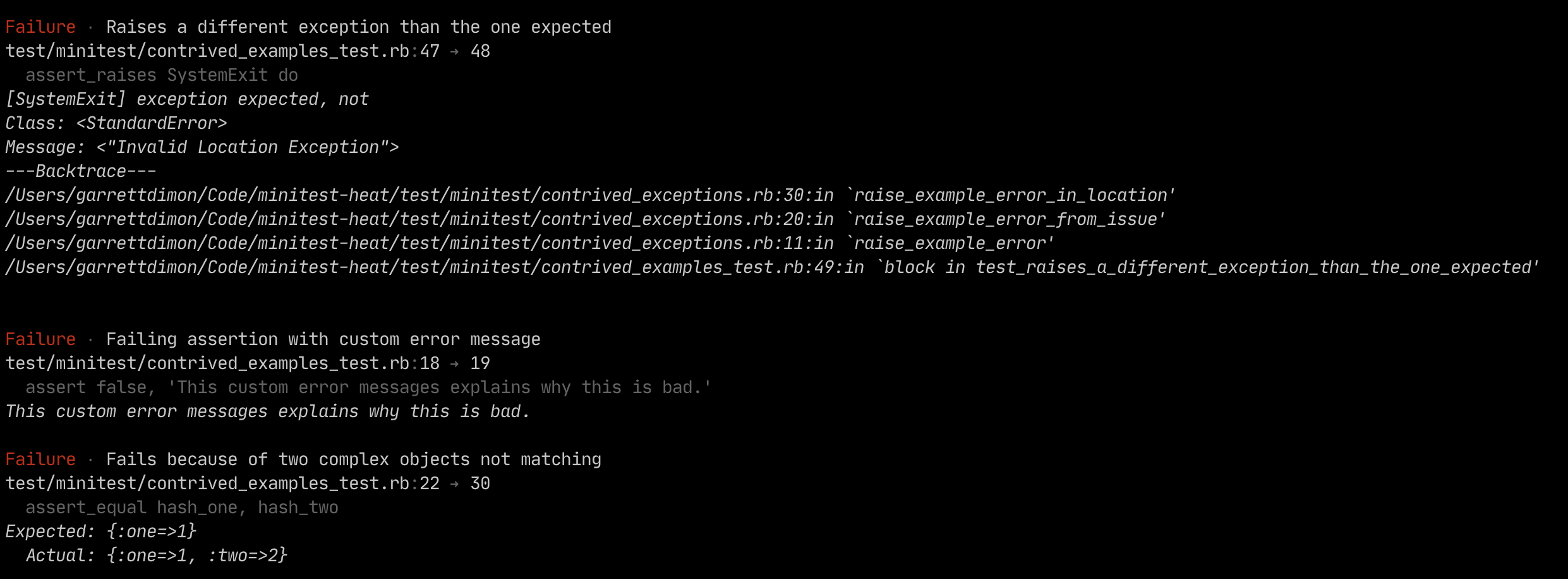
Test failures get a less-loud red ‘Failure’ label and replace the stack trace with the details of the failed assertion.
↩︎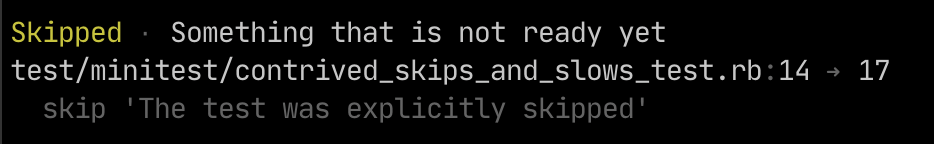
Skips are pretty simple and labeled with a yellow ‘Skipped’ and include the source code where the skip was defined.
↩︎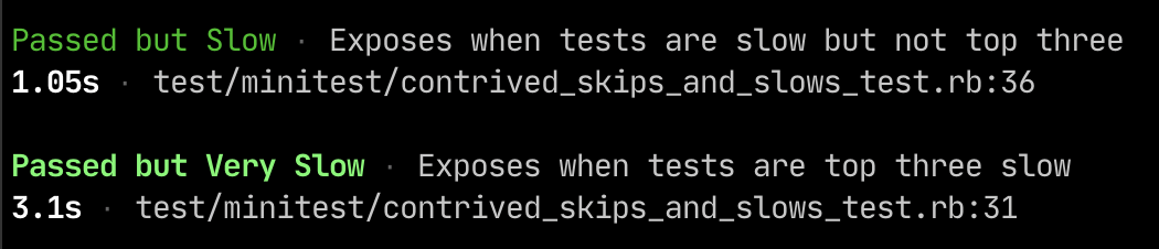
In the case of slow tests, all that really matters is how slow it was and where it’s defined. So details of slow tests are intentionally simple with the only difference being that the painfully slow tests are labeled with a slightly more bold green.
↩︎Nuance in Stack Traces
When exceptions arise, they can happen in your code or in a gem or other code that isn’t directly under your control. When Minitest Heat shows a stack trace, it automatically highlights the lines of code from your codebase so they stand out from other library or framework code.

At the moment, Minitest Heat strives to condense the stack trace while making it easier to identify which file is most likely to be the key to understanding the exception. It also notes which file from the stack trace was modified most recently because that can occasionally be helpful for determining which line from the stack trace is most relevant.
↩︎In addition to highlighting your code in stack traces, it also reviews the files in the stack trace to let you know which of those files was most recently modified. That way, if a recent change caused the test failure, you spend less time swimming through stack traces and jump straight to the source of the problem.
Reducing Noise
Since Minitest Heat recognizes nuance, it can also be more selective about what it reports, and it can prioritize those results based on the type of issue.
For example, exceptions are reported first, and if there are any failures, the results will show you the counts of pending or slow tests, but they won’t clutter the detailed results with the specifics of slow or pending tests unless all of the tests in the run pass.
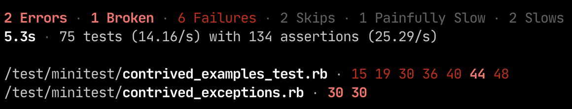
In this context, you’ll notice that while there are slow and skipped tests in the test suite, they’re visually muted a bit because the failing tests are the more important element to focus on. At the very bottom, you can see the heat map sorted by files with the most ‘hits’ and the sorted line numbers where those hits occurred. Furthermore, the line numbers are colored to match their corresponding category.
↩︎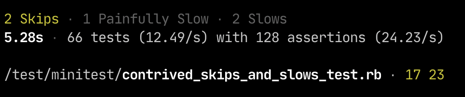
Once there aren’t any failures or exceptions, the summary slims down to focus on emphasizing any skipped tests while visually downplaying information about slow tests.
↩︎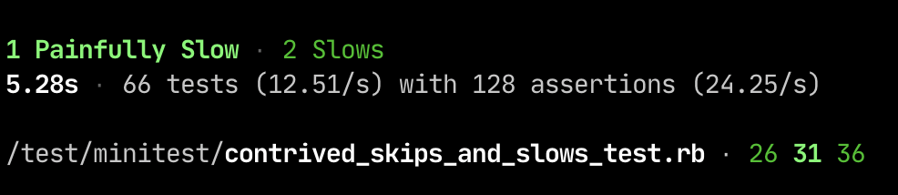
With slow tests, the summary only emphasizes the number of slow tests when there are no failures or skipped tests. Even without test failures, the heat map comes in really handy by making it crystal clear which tests are slowing you down.
↩︎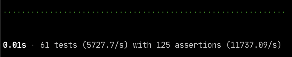
When everything goes well, there’s really not much to display. It shows the total time it took to run the suite, the number of tests, and the average performance of the tests and assertions.
↩︎Connecting Stack Traces
When there are exceptions, Minitest Heat looks at the stacktrace and begins building a heat map of where exceptions occurred. And when there are test failures, it similarly maps the failures to make it more obvious if the failures are are arising from similar locations.
Like most tools, Minitest Heat is a work in progress, but it’s definitely ready for prime-time. I’ve been using it actively for some time now, and it’s been very stable and helpful. When I work on a project that doesn’t use it, I definitely miss it.