One of the most challenging aspects of running a business is understanding why customers leave or otherwise choose not to use your product. The underlying problem is that if a customer doesn’t like your product, they’ll generally just write it off and not bother to share because they don’t care for it. So, you’ll generally only hear from people who already like your product to some degree.
The best way to capture this insight is when people are explicitly closing their account. Unfortunately, even in that case, they usually aren’t interested in helping you, but rather just moving on. Some companies require you to email them or otherwise make the cancellation process tedious so that they may insert themselves into the process, but I’ve always believed that canceling should be both self-service and incredibly easy.
Over the years, we’ve experimented with a variety of ways to encourage this last-second feedback while still ensuring that customers can close their account in a matter of seconds. I believe we’ve finally found the optimal solution for us, and there’s probably a lot of room for others to benefit from the same pattern.
We’ve tried about six different approaches, in no particular order, with pretty underwhelming results. About 2 in 10 cancellations would provide feedback, and that feedback was often not helpful. Fortunately, all of those less-than-perfect approaches helped me get to our current state which has blown all of the others out of the water.
Before digging into this, we haven’t run A/B tests or anything like that because I’ve never found the value in it. Moreover, an A/B test could, at best, detect the presence of feedback but not the value of the feedback.
- Post-cancellation personal email. To keep things simple and try to let people know that we care, I’d personally write an email to each cancellation. When people replied, we’d get good feedback, but the response rate was incredibly low.
- Post-cancellation Wufoo form. Not wanting to interfere with the cancellation process itself, we presented an exit interview form on the page that people landed on after canceling. Unsurprisingly, this generated very few results, and moderate value. The form took less than a minute to complete and was entirely on a single page.
- Post-cancellation Wufoo form with Starbuck’s gift certificate offer. For a while, we offered $5 Starbuck’s gift cards to encourage people to complete the interview. We designed the page to make it very clear that there was something in it for the customer, and this increased the response rate slightly, but actually lowered the quality of the results. The additional responses were short and uninformative as most just wanted to complete the task to receive the gift card.
- Free-form text on the cancellation page. In order to simplify the form and ensure it wasn’t overwhelming, we tried just leaving a free-form text field. This was by far the approach with the worst results. Not only were the response rates low, but the the feedback was generally terse and uninformative.
- Checkboxes + free-form text. This approach worked fairly well, but the labeling of the options drastically affected the quality of the feedback. Combine that with the fact that that the text-field was both visually and contextually separate from the options meant that few people did anything more than check a checkbox or two. Also, if people checked several checkboxes, there was no way for us to understand the weighting of each reason.
- Personal appeal with radio-buttons and relevant free-form text. This is our current approach, and it has blow the others out of the water both in terms of quantity, almost 100% response rate, and quality, usually at least a couple of sentences of clarification.
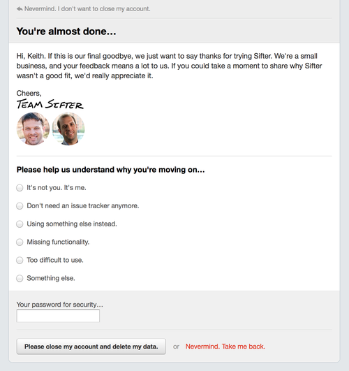
Screenshot of our current cancellation form.
↩︎Our current option has made the cancellation process a bit longer, but still incredibly short, and the feedback is still entirely optional. Based on my experiences with the afore-mentioned approaches, I believe there are several key facets to our success with this approach.
Copywriting
When using radio buttons and checkboxes, the labels of those options are incredibly important. For instance, an option for “Switched to a different service” is poor for a couple of reasons. If a customer is just trying out your service, they aren’t “switching”. Similarly, they may not be using another service but rather just sticking with a spreadsheet or sticky notes. So, we’ve gone with “Using something else instead.” This applies equally well whether someone is trying Sifter out or has been using it for years.
Another example is “Missing features.” The word ‘features’ is immediately leading them down a path of describing a feature as they see it in their mind rather than describing the goal they want to accomplish. When customers describe features, it often obfuscates their underlying problem, and when you know the underlying problem, there’s often a viable solution that’s just different from what they expected. We currently have an option labeled “Missing functionality,” but I’m considering changing this to “Missing capabilities.” I’m not sure the distinction is worth the tradeoff in clarity.
Minimal Non-overlapping Options
It’s tempting to add dozens of options to the form to provide a way to uniquely organize and classify cancellation reasons, but with too many options, the form becomes intimidating and just encourages people to ignore it and move on. More importantly, when there are a lot of options, you often end up with overlap and folks having a hard time choosing the option that’s the best fit for them. By keeping the options simple and broad, it’s easy for folks to find the option that’s best for them and then clarify their answer in the corresponding text field.
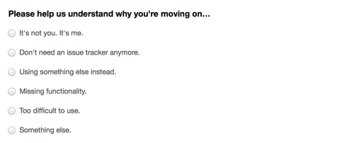
Screenshot of our cancellation explanations
↩︎Progressive Clarification
While radio buttons and checkboxes are convenient for customers, by themselves, they provide very little actionable information. For instance, if a customer tells you that they are using something else instead, the only helps if you know why they are using something else. Is it reliability, performance, features, support, ease of use, or something else entirely? Without the additional information, the checkbox itself is almost meaningless.
As a result, we’ve designed the form so that some of the options expand with a single follow-own question designed to solicit the underlying details. This adds a way for them to clarify without overwhelming them up front with a long and complex form. For example, when someone selects “using something else instead,” we followup with “We understand. Sifter isn’t for everyone. Do you mind sharing a little about what you chose and why?” Again, the copywriting plays a huge role here. We’re not just asking for “additional details” or if they could “clarify”. We’re giving them a simple and direct question tied to their decision.
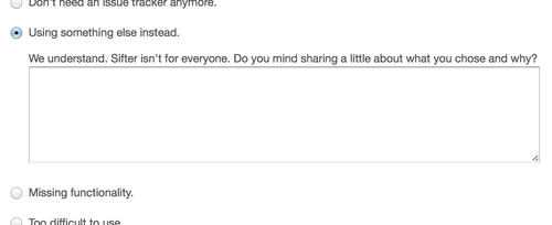
Screenshot of the related text-field after a radio button is selected
↩︎Focus
We’ve designed the final step of the cancellation process to be a clean, simple, and very focused page. This has helped remove any possible distraction and enabled us to make it feel less intimidating or demanding and more immediately comprehensible. As a result, the exit interview doesn’t get lost in a sea of competing information.
Personal Appeal
We’re a small team, and any of this feedback goes directly to me as the founder. However, given experiences with other companies, most people probably expect that the feedback is just going into a black hole of survey results and that it’s just a formality. So, to make sure people know that we care and are listening, we’ve added a short paragraph, photos, and a digitized signature.
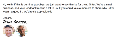
A screenshot of the personal appeal in our cancellation form
↩︎Summary
It took five years of reading cancellation emails and trying different things to understand a formula that would work for us. There’s still plenty of room for improvement, but the value of the feedback from this approach has been off the charts when compared to the previous efforts. The one tradeoff is that the process is now slightly longer, but so far, that doesn’t seem to bother anybody.
We’re now not only receiving more feedback, but it has all been incredibly useful and insightful. Receiving this actionable feedback while still making it simple and efficient for people to close their account feels like the perfect balance of helping us improve without getting in their way.