Easily-embedding high-quality visual elements into prose is the core idea behind the publishing system. Prose, code, and visuals are equals and all play a role in telling a story or sharing ideas.
A picture is worth 1,000 words.
While it may not be technically correct, the sentiment stands. There are concepts and ideas that are best expressed visually, and prose alone can’t tell the story.
The challenge with visual elements stems from the fact they involve additional files. From a publishing standpoint, those additional files bring friction. Where are the files located? What format are they? Have they been optimized?
Then there’s the question of how they be be represented in the markup? What if the markup for the visual elements needs to change across the whole system—to accommodate a different CDN, improve functionality or accessibility, or just fix a bug?
That summarizes the problems solved by using the visual ERb helper. All of the tediousness of storing, optimizing, and serving images in an accessible way with relevant semantics can be handled consistently and automatically.
Context with Content Types
“Visuals” is a rather large catch-all phrase for a wide variety of visual content. As such, it’s useful to consider the subtle differences and purposes of those different types of content rather than place them all in a grey box with a caption.
Screenshots
In general, screenshots should not use the pull-clean option if they include large amounts of text. This can make it difficult to discern between the content of the screen shot and content of the article.
Animation can and should be used to illustrate interaction, but the clips should be short and focused on a single interaction. If the interaction spans multiple pages or events, video is often better.
Charts and Graphs
With very rare exceptions, most charts and graphs should use the full horizontal space available to them with pull-full. Based on the default target width of 1200 pixels, most typography should be set in Helvetica Neue at 18 point with a line-height of approximately 1.4.
Axes should be set at a width of 1 pixel while the graph lines should be 2 pixels. Visualizations should be predominantly grey scale unless there’s an explicit need to add color.
Charts and graphs should be designed to a width of 1200 pixels. Due to the fact that SVG is scalable, it’s important to make sure that the graphics are always designed at a consistent size so that the typography is consistent from on visualization to the next. Charts and graphs should always be in the SVG format.
Sketches
Sketches will most often be used when illustrating concepts or ideas on paper that later evolve into a more tangible format such as wireframes or mockups.
When photographing sketches for use in an article, the photo should always be straight on and never taken at an angle or with any depth of field for artistic purposes. Sketches are content and should be photographed as cleanly as possible for simple translation to the articles.
Because sketches will be real photos, JPG is most likely the best format for them, but if there is a lot of flat color, such as white, Gif may be a more concise format.
Image Files Organization
The images for visuals are stored in the assets folder based on the entry type and slug. This reduces conflicts and ensures that browsing images on the file system correlates closely to their parent entries.
# assets/images/figures/posts/the-post-title/the-figure-slug.png"assets/images/figures/#{entry_type}/#{entry_slug}/#{figure_slug}.#{extension}" Having a consistent and predictable directory structure for image files enables the visual helper to handle more of the heavy lifting.
The Entry Type represents the module/class name of the parent entry. (i.e. pages, posts, chapters, interviews, or whatever other entry types are created in the future.) The Entry Slug is pulled from the entry’s filename without the extension because that context is always available whenever an article is rendered. The figure slug is the filename without the extension.
This provides a local file system structure that makes it easy to keep track of which images are associated with which posts. In the process of writing, however, visuals are designed so that you can be blissfully ignorant of the file structure—you don’t even need to keep track of what format or file extension the images use.
CDN
Behind-the-scenes, the images are all stored with Cloudinary. This provides basic CDN functionality along with some features that facilitate responsive images with optimized file size and image dimensions based on bandwidth, image style, device size, and pixel density. The nice thing is that there’s nothing to know about any of this except that it’s happening automatically when you use the visual helper.
Publishing
When deploying, bin/publish11This calls both the cloudinary:sync_static and content:persist rake tasks in order to ensure the correct assets are avilable. Either of these commands can also be run individually. will review the relevant directories and upload image assets to Cloudinary. The visual helper takes care of the rest. See the Cloudinary Static files documentation for more details on how this process works with Rails.
ERb Helper
In addition to the layout features of the figure_element helper, The visual helper automatically handles key parts of creating figures in order to reduce friction.
- The helper only needs to know the image file slug—not the storage directory or file type. The storage directory is determined using the entry’s slug, and the file extension is determined automatically.
- The helper also translates the file path to Cloudinary so there’s no need to look up or copy and paste the image paths—a terribly error-prone process if done manually.
- The Cloudinary-hosted images are optimized for the requesting device and connection speed by letting Cloudinary do its thing.
- The first content image on each page is given a
fetchpriorityofhighautomatically. - The
figuremarkup receives the necessary ID for figure references to link to it, and thefigcaptionelement automatically gets a link to return to the figure reference if a figure reference is present.
Examples
The visual helper method only requires two elements: the slug and alternate text. However, a caption usually makes sense and should be included.
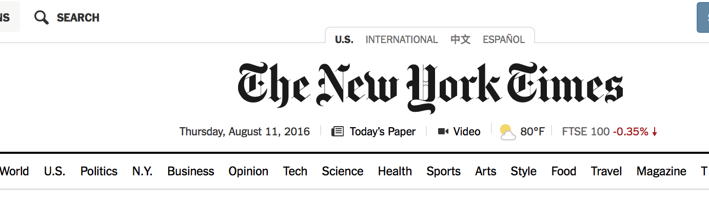
<%= visual 'measure', # where 'measure' is the filename slug alt: 'A screenshot of the New York Times masthead showing the signature typography with the date, weather, and main sections listed below.' %> The absolute minimum set of parameters to render a visual element. (Figure 2) shows how this code will be rendered.
The default for visual elements leaves them the width of the prose measure.
Like other figures, visual elements can be nudged to use the full-width of the content by specifying pull: 'wide'.
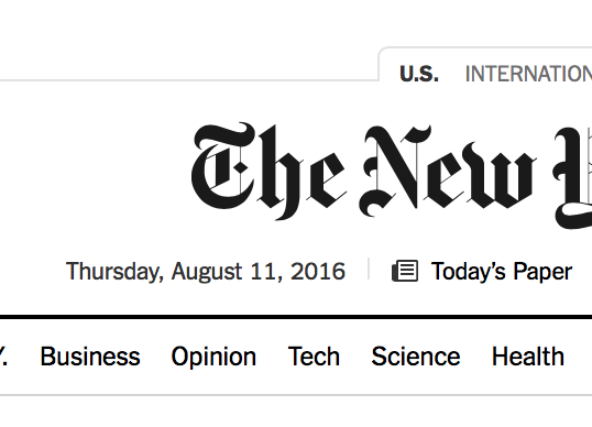
<%= visual 'wide', # where 'wide' is the filename slug pull: 'wide', alt: 'A screenshot of the New York Times masthead showing the signature typography with the date, weather, and main sections listed below.', caption: 'The default for `visual` elements leaves them the width of the prose measure.' %> By specifying pull: 'wide', a larger visual element can use more of the available space. (Figure 5) shows how this code will be rendered.

In order to accommodate larger images visual elements can use pull: 'wide' to let them use more horizontal real estate.
In some special cases, images may be able to justify using even more available space with pull: 'full', but this should be used sparingly as it breaks out of the flow of the prose.
<%= visual 'full', pull: 'full', alt: 'A screenshot of the New York Times masthead showing the signature typography with the date, weather, and main sections listed below.', caption: "In order to accommodate situations where images can justify the even more space, `pull: 'full'` provides the answer." %> By specifying pull: 'full', the largest visual elements can break out of the margins.

In order to accommodate situations where images can justify the even more space, pull: 'full' provides the answer.
In order to accommodate situations where images can justify the even more space, pull: 'margin' provides the answer.
And finally, when working with a smaller visual element, it can be placed in the margin using pull: 'margin'.
<%= visual 'margin', pull: 'margin', alt: 'A screenshot of the New York Times masthead showing the signature typography with the date, weather, and main sections listed below.', caption: "In order to accommodate situations where images can justify the even more space, `pull: 'margin'` provides the answer." %> By specifying pull: 'margin', the largest visual elements can break out of the margins.
Modifiers
In addition to the variants that affect sizing and layout, the modifiers can be particularly useful with visual elements.
Visual elements that would work better without any kind of container can use the clean modifier.
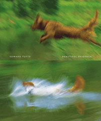
<%= visual 'margin-clean', pull: 'margin clean', alt: 'The book cover of Beautiful Evidence illustrating two photos blurred from action with the top photo showing a brown dog mid-jump over some water against a green background with the bottom photo depicting the same brown dog making a large splash as it lands in the water.', caption: 'Visual elements that would work better without any kind of container can use the `clean` modifier.' %> An example of a visual helper with a clean modifier to remove the borders and padding. (Figure 12) shows how this code will be rendered.

With smaller visual elements that don’t need to consume the full width available to them, the compact modifier can let them shrink to their natural size.
<%= visual 'margin-clean-compact', pull: 'margin clean compact', alt: 'The book cover of Beautiful Evidence illustrating two photos blurred from action with the top photo showing a brown dog mid-jump over some water against a green background with the bottom photo depicting the same brown dog making a large splash as it lands in the water.', caption: "With smaller visual elements that don't need to consume the full width available to them, the `compact` modifier can let them shrink to their natural size." %> An example of a visual helper with both clean and compact modifiers to show a more minimal margin figure. (Figure 14) shows how this code will be rendered.
<%= visual 'wide-separate', pull: 'wide separate', alt: 'A screenshot of the New York Times masthead showing the signature typography with the date, weather, and main sections listed below.', caption: 'The default for `visual` elements leaves them the width of the prose measure.' %> The absolute minimum set of parameters to render a visual element. (Figure 16) shows how this code will be rendered.
The default for visual elements leaves them the width of the prose measure.