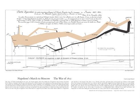
As an anti-war poster, Minard’s depiction of Napoleon’s march to Moscow successfully combines information density, clarity, and simplicity to portray the deep costs of war in terms of loss of life and hardship.
↩︎A framed poster of Charles Joseph Minard’s map of Napoleon’s march to Moscow has hung in my office since I received it somewhere around 2005.(Figure 1) In its own way, it has been one of the most significant influences during this redesign. It was direct, concise, beautiful, and engaging all at the same time, and I loved it.
I received the poster at a workshop given by Edward Tufte in Dallas, and in that workshop, he presented real, tangible examples of some of the world’s best information design. As a result, my ideas on presenting and sharing information started to feel incredibly inadequate, and I began to look at design and information in a new light.
At the workshop, we also received copies of his books, which were no different than the workshop. They were overflowing with real examples from both ancient and recent history, and each example brought tangible clarity to the ideas presented. For the last couple of years, I’ve referred back to these books regularly, and they have dramatically influenced how I approach information design. In fact, his books were the initial inspiration behind this redesign.
I originally started to write in depth about the redesign and my thoughts behind it, but felt that was the wrong way to go about sharing. Instead, I decided to share my inspiration by focusing on the inspiration behind the changes. The initial inspiration came almost exclusively from Tufte’s books. Throughout his books, Tufte uses images, charts, graphs, examples, and quotations to support and illustrate his ideas by showing instead of telling. (Figure 2) As you flip through, you quickly see that almost every page is full of rich and intriguing examples.
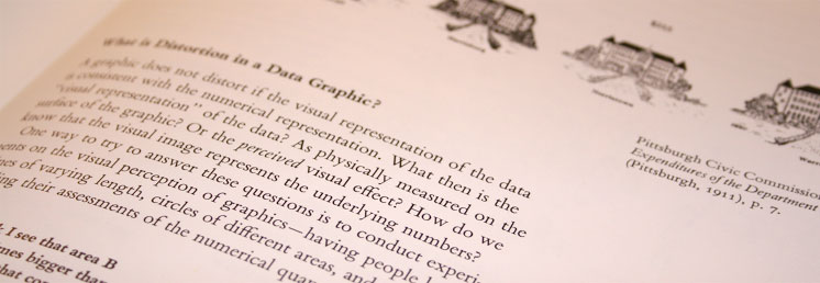
Throughout his books, Tufte uses images and references to support his ideas.
↩︎Boiled down to the simplest point, I knew that I needed to provide more visual examples of my thoughts and ideas as well. Discussing design or interfaces requires a level of visual engagement that I wasn’t providing. Too often I relied on words to tell the story, and more often than not, I left room for interpretation and ultimately failed to explain myself. The first words in “Beautiful Evidence” are from a quote by Galileo…
What was observed by us is the nature or matter of the Milky Way itself, which, with the aid of the spyglass, may be observed so well that all the disputes that for so many generations have vexed philosophers are destroyed by visible certainty, and we are liberated from wordy arguments.
By relying on imagery and tangible examples, and less on my rhetoric, I hope not only to improve the quality of my communication, but also the clarity of my ideas. This entire redesign was motivated and designed around that single goal. I needed a format that enabled and encouraged the use of examples. This includes code, screenshots, or anything else that helps me communicate. The design had to put the content first. In fact, the content had to be the design.
The layout and proximity of examples makes it easy to quickly visualize the ideas without breaking stride while reading.
↩︎Visual decoration had to be kept to minimum. For me, this meant forgoing any heavy visual treatment of the header or inclusion of a mark or logo. Once I was done deciding what I wouldn’t do, I was left with a very simple structure for design. I would have to rely on typography, the grid, and whitespace to create an aesthetically pleasing experience. Not coincidentally, these were areas that I had grown increasingly interested in as a result of reading Tufte’s books.
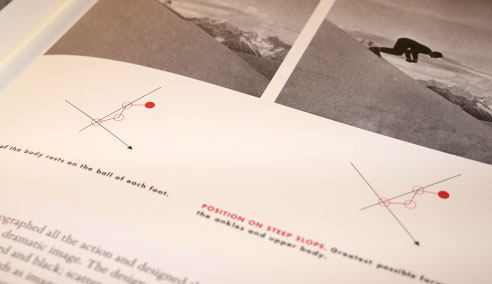
The typography, grid, and widespread use of examples were all incredibly well crafted. I regularly found myself almost hypnotized, lost in the depth of the examples. They were dense and simple at the same time. Tufte has put together an exhaustive reference of some of the most beautiful information design in the world. (Figures 3 & 4)
In Tufte’s books, the references and examples are as rich and interesting as his commentary on them.
↩︎He isn’t afraid of letting the examples be more interesting than his commentary. In fact, during the course of the workshop, he frequently pointed us to pages in the books knowing that we would temporarily ignore his speaking and get lost in our own private examination of the examples. He didn’t mind if we found the examples more interesting than his speaking. He didn’t mind if we weren’t listening. This is because the content was the presentation. The discourse enhanced the depth of the examples, but the examples themselves were always the real focus.
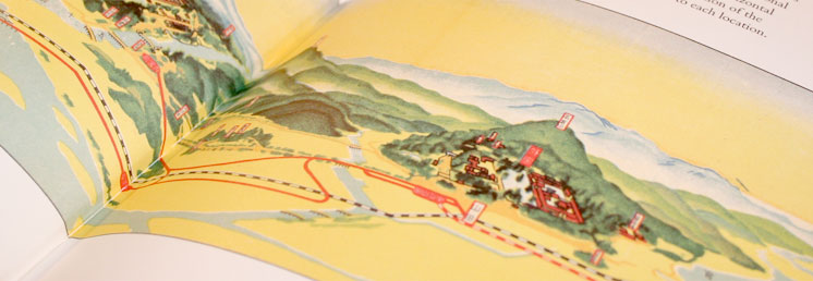
Similarly, one of the most interesting ways in which Tufte illustrated his ideas was by taking an existing piece of work and showing what it would look like if he had his way, and it was never disappointing. While the original piece at a glance rarely looked horrendous, the result after cleaning it up, was never short of stunning. (Figures 5 & 6)
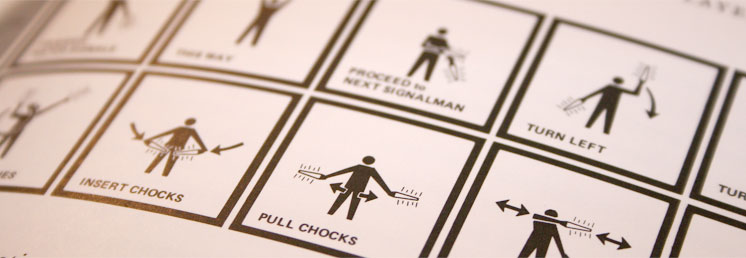
In Envisioning Information, Tufte uses this illustration of marshalling signals to show bad information design where the strokes are all of equal weight and there is a distinct lack of variation.
↩︎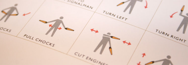
In Envisioning Information, Tufte uses this illustration of marshaling signals to show how simple improvements can make a world of difference. (We won’t even get into the small savings in ink cartridges.)
↩︎Tufte also does an excellent job of summarizing his thoughts and principles into short memorable phrases. Small multiples. Chartjunk. Sparklines. All of these are multi-faceted concepts boiled down to an easily digestible phrase. Sparklines in particular really represent the breadth of Tufte’s ideas. (Figures 7 & 8) They are extremely dense, involve no excess decoration, can be used together in quick succession for small multiples, and work inline with text. Yet, they are still only a small piece of a much bigger picture.
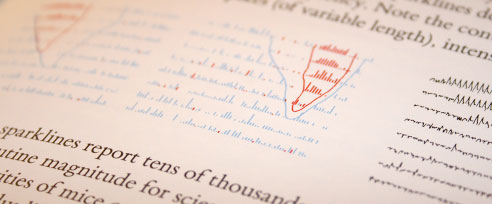
In this example, Tufte uses sparklines to visualize relationships between data. Much of the data is as beautiful as it is accurate.
↩︎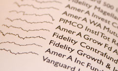
A small example of using sparklines to compare the relative behavior of various funds.
↩︎While much of Tufte’s principles aren’t directly applicable to my writing and subject matter, the way in which he shares and explains his ideas definitely is. They say pictures are worth 1,000 words, and if that’s the case, I figure I’ll be saving myself quite a few keystrokes. I’m hoping that as a result, I can become a more effective communicator and focus more on refining and presenting my ideas.
Of course, this redesign is about changing a layout to accommodate more pictures, but I also hope to significantly improve my writing, the organization of my thoughts, and the overall quality of my posts. While I can’t really predict how it will unfold, my goal is to invest more time in preparing posts which means they could be significantly less frequent. On the other hand, in the past, I have caught myself not posting about something simply because it wasn’t easy enough to add the images that explained it. So now, maybe I’ll be able to post more often because of the framework of markup underlying the redesign.
It may not look like it on the surface, but a lot of thought has gone into this redesign. The aspect that I’m most excited about is that the majority of the inspiration was derived not from the visual work of others, but rather from the ways in which they shared ideas. It has all been brewing in my head for a couple of years now, and I’m thrilled to finally have it all wrapped up.
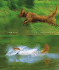
Beautiful Evidence, as well as much of Edward Tufte’s other work, were responsible for much of the inspiration behind this design.
↩︎While the inspiration and motivation behind the redesign originated from print, I still had to translate those ideas to a different medium. That required online inspiration which came from sites that delivered rich and engaging content with minimal decoration. The content was the design. The typography was the decoration. And the grid and whitespace were the visual hierarchy. In my opinion, these sites represented classic design at its best and left a lasting impression on me as a result.
Both Khoi Vinh and Mark Boulton piqued my interest in the grid and typography. Working with Jason Santa Maria on a panel really shed light on how powerful and interesting typography could be. Jason’s redesign of A List Apart, where almost the entire design revolved around typography, opened my mind. Similarly, Dan Mall’s site played a role in showing how typography alone could be the design. Of course, there were others. Coudal Partners typography, John Gruber’s writing and detailed support for his ideas, Dan Cederholm’s touches of CSS typography, Jared Christensen’s writing, Greg Storey’s writing, and even The New York Times all played a role in how the design unfolded. That list isn’t exhaustive, but in my retrospective, those were the sites over the last couple of years that have really impressed me.
I originally wanted to showcase their designs and their work, but this post would have never ended. Also, there’s plenty of time for that in the future. Some time ago I had started a collection of bits and pieces of inspiration which has since fallen by the wayside.11I had been using a free Flickr account to compile and share screenshots of small design details, but I always felt that the format wasn’t doing the work any justice. It felt like I was dumping the elements in a pile instead of showcasing them. However, this redesign enables me to discuss those design elements here, so I think it’s safe to say that their work will appear here all in due course.
Summary
This redesign was about and inspired by better content. I’m extremely thankful for the individuals and teams with an apparent passion for communicating ideas and information with amazing clarity. It is thanks to their work and ideas that I was able to see things in a new light. This redesign was, in fact, only tangentially related to design. It was really about a desire to communicate more effectively—because that seemed like a worthwhile goal in itself.